eCommerce Usability Guide: How Can It Help You Improve CX and Conversions
-
 Kevin
Kevin
- 3 years

Usability is related to user experience. It is defined as the ease with which a website visitor can interact with its components. If an eCommerce store has strong usability, users can access it more comfortably, and it is easier to navigate.
However, poor usability means that users get lost after visiting the store and can not complete the desired actions swiftly, leading to higher bounce rates and low conversion rates. As a result, it can cost you customers and millions of dollars in revenue.
While you can optimize your store’s usability with user testing, following best practices when designing and developing your website is best to avoid problems later on. This blog lists several best practices and everything you need to know to provide your customers with the best experience possible. So, read on!
How to Improve eCommerce Usability for Better CX and Conversions?
There are several ways to make improvements in eCommerce website usability. Here are some of the best practices that you should follow:
1. Keep Navigation As Simple As Possible
If your customers cannot find products seamlessly on your website, it is the most significant design blunder you can face. To improve the usability of your website, you need to make the navigation as effortless and smooth as possible.
It will turn your website visitors into regular and loyal customers of your brand. You need to design your navigation to make it easy for consumers to find the information they are looking for, compare products, and complete the purchase process in minimum steps.
Here are some of the navigation best practices for eCommerce websites:
- Deploy responsive navigation designs
- Make the main navigation bar sticky
- Make clickable elements obvious
- Use heatmaps and analytics to optimize designs
- Leverage a sitemap to build the site structure
- Limit the number of menu elements
- Use conventional icons and symbols
- Always make going back to the homepage simple
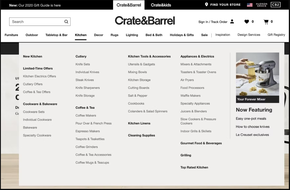
In addition, you should always divide categories and subcategories into manageable chunks. More than 60% of eCommerce websites fail to do this, and that’s one of the main reasons behind low conversions. Here is an example of perfect navigation for an eCommerce website:

2. Implement a Smooth Checkout Process
A tedious checkout process leads to shopping cart abandonment, resulting in low conversions. Thus, the checkout process on your website needs to be efficient and effective.
Reduce the amount of information you require from customers. For example, do not ask useless questions just before completing a purchase and place a checkbox to autofill shipping information once the user enters it. The shorter the checkout process, the better the conversions will be.
In addition, let customers checkout as guests. Requiring users to fill up long forms for registration doesn’t make sense anymore and may lead to them leaving your eCommerce store. Ideally, the checkout process should not include more than two or three steps. And a carefully crafted checkout process can help you increase website usability as well as conversions.
Also Read: Magento Theme Development: 5 Tips to Take the UI/UX of Your Store to the Next Level
3. Make Everything Clearly Visible and Readable
If the content on your eCommerce website is not clearly readable, this mistake can cost you thousands of dollars. That’s why one of the most crucial eCommerce usability best practices is to select the right typography.
We understand that deciding on the right font size, type, and color can be tricky. But, if you hire expert eCommerce web designers and developers, you will get through this in the best way possible.
You may spend a fortune in selecting the most expensive eCommerce development platform or offering the best quality products, but if you make this one usability mistake, you are not going to get conversions. Content is crucial for persuading users to buy, and it must be clearly visible and engaging.

4. Optimize Website Speed
More than half of the website visitors leave a website if it doesn’t load within three seconds.
Isn’t it shocking? It is important to note that slow page load speed hampers the user experience of a website because it makes users anxious. That’s why it is crucial to optimize website speed. In addition, your website speed also impacts your visibility and SEO rankings. So, make sure you optimize page speed to improve usability and conversions.
5. Pay Heeds to Website Accessibility
Websites that are not accessible to all, irrespective of what disability they have, are not offering an experience with maximum usability. Online businesses that want to improve traffic or customer retention rate must provide a CX that caters to its target audience, including those who are specially abled or have hearing or sight impairments.
Website upgrades to improve the accessibility of a website are simple and do not require a lot of investment. Features like keyboard navigation, search by voice, and alt-tag descriptions all contribute to better website usability and accessibility. All you need to make your website highly accessible is a bit of know-how and thoughtfulness. Also, the more customers you target, the better the conversions will be.
Also Read: Web Accessibility: Why eCommerce Retailers Should Care About it?
6. Invest in A/B Testing
A/B testing is one of the cost-effective ways to recognize issues with the usability of your online store. Scheduling random tests in light of two variations, A/B testing is a simple way to test individual components of your online website. For instance, before going live with a new page or logo, you must see how your customers use it compared to how they used to interact with the old designs.
A/B tests are a savvy method for developing your store in alignment with your business needs and customer requirements. They help you predict how customers will respond to changes so that you can manage every upcoming issue.
Wrapping Up
To stand out in the eCommerce market, online store owners need to improve usability to make the purchase process easier. This implies determining what consumers want and giving more comprehensive accessibility options. Otherwise, it would be hard to improve conversion rates in eCommerce. Usability improvements give your site the best opportunity to draw in buyers and direct them toward a purchase.


