An eCommerce A/B Testing Checklist to Increase Conversions
-
 Kevin
Kevin
- 3 years

eCommerce is an ever-evolving industry, and nothing works all the time here. That’s why it is always recommended that retailers should keep trying new ways to grow their online business and find out what works for their target audience.
It is not a new concept, but there is a lot to learn regarding how to optimize your store efficiently. When done right, eCommerce A/B testing helps you find invaluable insights into the likes and dislikes of your consumers.
You can also get useful data about how your marketing efforts are performing and what you can do to improve ROI. In a nutshell, you can improve your online store’s KPIs by employing efficient A/B testing strategies. In this article, we will discuss how. So, let’s get started.
What is A/B Testing?
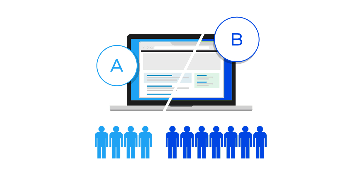
Also called split testing, A/B testing helps you identify the most successful elements of your online store in terms of design, functionality, content, and other things. It is a method of comparing different page elements and combinations to find how they appeal to your site visitors. For example,
a) You could be testing two different CTA with different copies and colors to find out which one performs better and drives more clicks.
b) You can also change your navigation bar design to test which design your consumers find more engaging.
In short, A/B testing helps you improve your decision-making abilities so that you grow faster and generate more revenues. Here is how you shall do it:
Research: Find out what your competitors are doing. Pay attention to details, find their flaws, and focus on solutions to solve the problems.
Prepare Hypothesis: Now, create assertions to be tested based on the data you find. For example, if users are not finding a product in your store, it could be because of the wrong categorization.
Define Parameters: Set the parameters for the test, for example, for how long you would experiment with a certain element. Or how many visitors are expected to respond in order to validate a test.
Begin Testing: Use an A/B testing platform to launch your test and record data to make informed decisions.
Where Can You Use A/B Testing to Improve Conversions?
As an eCommerce business owner, the number of elements that you can test is endless. There will always be a scope for improvement in the elements of your eCommerce store. So, the only key is to never stop iterating and keep testing what works best for your customers.
Here are some of the most common elements on which you can use A/B testing:
1. Call to Actions (CTAs)
Your CTA is going to be one of the most important factors that will be responsible for driving conversions to your site. Thus, it should be bold, catchy, attractive, easy to find, and clearly visible.
But, there is no mantra to create such a perfect CTA other than trying and testing what works best. As an eCommerce marketer, there might come many questions in your mind when designing CTAs, including:
a) How big should the CTA be?
b) What colors will look more attractive to the audience?
c) What should be the button size?
d) How must the copy sound to drive clicks?
e) Where should it be placed for better visibility?
Unfortunately, you won’t find a guide on the internet that will answer all of your questions. All you need to do is a test. Here are elements you should pay attention to for designing an effective call to action:
f) The Language: You must test the language of your CTAs to drive the desired clicks. It should be short (1-3 words are enough), and you must utilize actionable language. But, while testing language, you must keep all other elements of the CTA same, for example, shape, colors, and font size.

g) Plain or Complex Design: You can also do A/B testing on the design of your CTA. For example, whether plain CTA will entice your customers or iconography will do the needful. Test it, record the results, and choose what works best.

h) CTA Colors: Colors play an important role in changing the minds of consumers. Find out what background color will work best for your brand. Here, you should avoid using colors like green-red, which are difficult for human eyes to process.

2. Typography
It is little elements that make a big difference when it comes to eCommerce selling. So, other target elements for eCommerce A/B testing are font spacing, size, and type.
Make sure you choose clear fonts that attract your users instead of distracting them. For example, brands like Apple use plenty of white spaces, minimal designs and descriptions, and large font sizes for increased readability. Find out what works for you and stick to the same.
3. Media or Visual Elements
As we all know, the human brain remembers in pictures instead of text. Thus, it is crucial to optimize the media on your eCommerce platform by doing A/B testing. Here are things you can test when testing visuals:
Type of Images: You may test what type of product images work best for your brand. You can select between images of people or pictures of objects. Also, you should test whether images work best for your business or videos.
Image Size: Your pictures should show the objects you are selling clearly. But that doesn’t mean you should always use big-size images for the same. Test what looks best, and then select the appropriate size.
If your eCommerce platform sells complex services or products, a combination of images and videos might work to improve your conversion rate. But, your video should include a persuasive message that can attract the audience.
4. Alignment of Pictures and Other Media
One of the greatest eCommerce marketing mistakes is not giving a lot of significance to the alignment of media on your e-store.
It would also greatly rely upon the text placement. So, make sure that they are complimentary. You might try and do A/B testing between the right and left alignment for the pictures. Many times, a central alignment also works well. So, test and see what turns out best for your store.
5. Website Forms
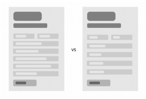
This is one of the most important elements to focus on while optimizing conversions on your eCommerce store. The forms on your website must be well-optimized so that users feel the excitement of filling the same, and you get leads.
You can A/B test what type of forms work best for your website. For example, test whether your customers like to fill a form with fewer fields or simple placeholder text.

6. Manual Search or Drop Down Search
The ultimate goal behind A/B testing is to simplify the customer experience on your website. Thus, make sure your customers are able to find the products they are looking for easily in your store.
A single and minimalistic search bar may look easy to your users, but a drop-down search that provides them with clear choices about product categories can ease their work by many folds. Test what works for you and choose the best option.
Wrapping Up
While optimizing each element of your site can impact your conversions by many folds, you need to do it carefully for better results. For example, you should avoid cloaking, use a temporary URL redirect, and execute the test as long as required. If you need any help, contact expert marketers at Envision eCommerce and save your effort and time.


