How to Create a Baby Online Store: eCommerce Website Development Tactics
-
 Nidhi Arora
- 9 years
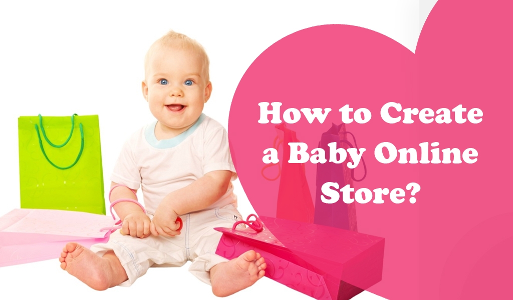
This might sound overwhelming, but it’s an essential part of the puzzle: How to create a baby online store? Creating a baby care products online store is not as any eCommerce website development. There are thousands of things that you need to consider while designing, or creating a web store for baby gears. The most crucial thing is to match everything of your store with mothers or parents’ state of mind & winning them in terms of your customers.
To be a store owner, you need to keep in mind that your main target is mothers (between 25-32 age groups), if you are not able to make them happy, then there is no point of your online store. Whether you already exist or just start-up in an online market, you need to use complimentary products, playful designing, and other baby-centric techniques that will give a personalized shopping experience to moms and increase the value of your orders up to 40%. According to the research, it is displayed that out of 1000, 53% UK online shoppers like browsing products that are recommended on their previous purchasing history. So keep all such things in mind and learn useful attributes of successful baby products online stores.
Here we have compiled some high-tech recommendations that you really need to implement on your baby products online store to keep your potential customers like mothers focused on your site.
A Baby Product Industry & Customer match:
Validate Customers Who Shop Online for Kids Products
In the first place, to create an online baby store, you must know who your real audience is. Undoubtedly, your real customers are digital mothers between 25-32 age groups who are constantly juggling & multitasking and don’t have quite time to go to market and shop essential baby products. For example: pregnant women, single mothers, working professionals or anyone else who experience the inconvenience of physical baby products shopping. You also need to identify their presumed household size, income, where they prefer to shop online for baby products, what baby products make them lure, etc… Understanding your niche market will also help you to focus on creating the right content that drive engagement. Abstractly, you need to identify:
Who the mothers are
You know how to target them (the baby care blogs they read, the baby stores they love to visit, the baby products they search in Google etc.)
How they choose & compare baby products
We recommend you to structure & plan content on your baby online store in tune with the moms.
What baby products they want
Your value proposition can elaborate precisely that & the entire baby store can be 98% significant to them.
What things they don’t care about
we recommend you to identify what baby products they don’t much care about and you can dismiss that products or cut them from your baby store.
Thanks to your online services, you recognize which end-benefits to transfer.
… and so on & so forth. It is all about matching your store with mother’s state of mind and gaining them as your customers.
Reliable eCommerce Platform Recommendations
Before, you might have limited options to have a hands-on system for launching brand name, but now you are offered with the number of the strongest e-commerce platforms like Magento, WooCommerce, Shopify, etc. that gives a remarkable result to your business. So, now pick a one that is faster and better for your baby online store.
If you cannot decide which is best for your business, you can take help from Envision E-commerce. We can help you choose a reliable ecommerce platform should have following features:
• Flexible & User-friendly
• Up-to-date as per latest ecommerce standards
• Easy to scale & customize
• Easy to manage
• Provides a better support to store admin
• Supporting to the Multivendor feature
• A flexible backend support for ever-growing baby product inventory
UX-Focused Recommendations
Effective Header Recommendations
The Baby online store’s header is as important as we need oxygen to survive. This is one of the first thing users will notice when browsing your web store. Make sure your baby products online store just like a baby, should have a cute as well as an adorable personality. However, this is the ideal way to present any online baby store and lure mothers to keep on scrolling.
The header section of your baby products online store should not only unique, but it should also be attractive and kids-friendly at the same time, so that moms feel that she is at a right place for her baby’s good-will.
Below we recommend you some charming header section that you can use to make the first impression a lasting one:
• Consider the phone number at the top of your website on the left corner and put the other essential features like ‘Search’, ‘Login’, ‘My Cart’, and ‘Wishlist’ on the other side along with kid’s favourable colored icons, like pink, blue, green, etc.
• You have to use vibrant colors, cute cuts, and cheerful logo to make the baby products online store look attractive.
• We also recommend you to place a more visible, fast, useful & efficient in-site search functionality in the top header.
Kid-centric Themed Newsletter Subscription Popup Recommendation
We do suggest you to display a kid-centric themed newsletter subscription popup with some discounts and special offers on the front foot of your online baby store. And, you can collect a huge number of emails.
Recommendations for More Detailed Baby Product Pages
You know what, customers will remember 80 percent of what they perceive with the eyes and 20 percent of what they read. To provide your customers with a great shopping experience similar to an in-store shopping experience, you need to focus on your products pages:
• A good product page should have the relevant product description and we recommend you to use descriptive words rather than just highlighting product specifics. The descriptive words are more impacting on the customers.
• A detailed product pages should have product specifics such as size, weight, material, dimensions and any other important feature.
• Another more beneficial recommendation for you – display “add products to wishlist”, “check COD availability for your region”, “share on social media”, “add to cart -with any number of items”, “add to compare list” – on your product detail page.
Include Related Products on Product Page
A reliable ecommerce platform always permits you to include related prod-ucts on your product pages. These related products can give you a big ad-vantage in terms of add-on sales for your baby online store. For example: If your baby store is having baby trolley bag product page, you can showcase other related products on that page, including baby zippy pouches, note-books, planners, etc.
Use High Quality Baby Product Images with Multiple Angle Shots
High-quality product images with multiple shots help you to display your products to customers with a real product look similar to holding & feeling a product in their hands. You can also implement a product zoom feature on to your product images so that you customers can getting up close to baby product to see the finer details. Showcase your baby products with the images of front, back and sides and even with detailed shots of particular product features.
Useful Filtering & Sorting Options on Product Pages
It is beneficial to add useful filtering & sorting options on the baby product page.
An Efficient eCommerce User Interface
You should provide an excellent eCommerce user interface for interactive shopping experience for customers.
A recommendation for Easy-to-Navigate Breadcrumbs
Make sure your store has easy-to-navigate breadcrumbs on all internal pages of site.
One Step & Fast Checkout Process Recommendation
More than 70% of customers abandon during checkout due to a long, confusing or multipage checkout process. Thus, we suggest you to implement one step checkout process for easy checkout process for your customers.
Easy-to-use Shopping Cart & Login Box
It is impossible to imagine a baby online store without a shopping cart & login box. Place these must-have features close to each other for the ease of your customers & should be easily visible to your customers. Login box is neccesay if you are offering subscription option to your customers. On behalf of our years of experience in offering eCommerce solutions, we recommend you to choose an ecommerce shopping cart that also allows for product ratings and reviews, is having a simple user interface and coupled with many more features.
Product Rating & Reviews Rock Your Store
No matter how fine your online baby store support baby products, reviews by you real customers will surely produce a greater impact on new visitors & will also help you to build trust about your baby products among them. We recommend you to display product rating & review section on each baby product of your store & allow “word of mouth” work for you.
Site Navigation Recommendations
Site navigation is another crucial thing to scrutinize. As you are dealing with the baby products business website, you must have:
• An Easy-to-Navigate Navigation Bar with all important top-level destinations for mothers such as Baby blankets, Baby bath wraps, kids nursery decor ac-cessories, Baby clothes, Diaper Bags and other baby products.
• Baby Product Categories with Anime Images: We also suggest you to high-light categories sections with anime images in the site navigation to give a more attractive look to your web store and help mothers to find exactly for their babies in no time.
• ‘What’s New’ Category: However, this is one of the useful and time-saving features for both sellers and buyers. At a baby online store, you should create ‘New Arrivals’ subcategory for each of the main categories like Baby blankets, Baby bath wraps, kids nursery decor, Baby clothes, school, personalized & gift, Diaper Bages etc. so that busy moms can easily find what they want for their little ones.
• Similar & Smaller Categories Grouped Together: Make sure to keep similar baby product categories together so that your customers can easily navigate through different categories.
Homepage Recommendations
Believe it or not, users take only 3 seconds to decide whether they bounce off or take it to the Add-to-Cart stage. And, a homepage is the entry-point of your web store, so you have to be sure that your website’s home page is designed well and able to mesmerize and convince mothers down the funnel.
• We will recommend you to display the most demanded and popular baby products on your site’s home page by using the colorful palette, anime and baby’s pictures, fun fonts, etc. to attract the attention of mothers.
• Most of the eCommerce owners display an ample of offers and products organized by category on the homepage, but they rarely change the pictures. So, there is a need to update or revamp it regularly to get a whole new vibe on your store.
• More on, you can choose to display other info like social profiles or Customer Support details in the footer of the Home page to keep the design clutter-free.
• You can display some charming baby images with your baby products on your home page and link them directly to your product collection. It will help your customers to have a look on your baby-products rather than navigating through the main navigation.
• We do recommend you to avoid too much content on your home page, how-ever, if you still need to display the content, you can put it further down the page.
• Ensure that your home page is having some ever-present, tasteful & eye-catchy CTA (call to action). We recommend you to place them onto your kid-centric banners.
Payment Method Recommendations
As an online baby product seller, your online store should have a clear & secure payment system. We do suggest you to display every possible or available payment method to your customers so that they any mom or parent can buy baby products from you. Allow your guest customers to make payments with requiring an account and ensure them that their payment & personal details are secure from prying eyes.
Mobile Enabled Online Baby Store
In today’s mobile era, most of the mothers or parents access the internet via their smartphones more than their desktops. As you are running an online kid store, we recommend you to make your store mobile-enabled so that you can leverage more benefits from the mothers or parents who’re on their mobiles & looking online for best baby products.
Summing Up:
And that’s it! These are the guidelines that we recommend you to follow for a successful online baby products store. Make sure create all pages of your baby online store even more exciting and unique that influence parents, especially moms buying decision.
Just go beyond, think about your niches and approach the experienced designers and eCommerce solution specialists to create your baby products online store to boost your market sale. As long as parents continue to have babies, your online baby store will carry on to grow & flourish. If you have other ideas or suggestions that would be helpful for creating such a baby-product based online store, make sure to leave them in the comment section below.
Download Blog
